How to make sense out of webpage data tables using pandas?
Introduction
We may have come across many occasions where there are many tables filled with lot of data in a web page. If we want to do data analysis from these tables directly, it may not be possible. We need to convert these tables into csv or excel format. This is where Python pandas come to our help. Pandas makes it very easy to scrape a table on any web page. Pandas has an inbuilt capability to read a complete html page, scan through the <table> tag and extract them as tables. These tables are then converted into a DataFrame. After this, it is possible to apply various statistical methods, filters and do an initial exploratory data analysis. In this blog you’ll learn how to extract a table from any webpage, how to apply various methods from pandas and also we will see how we can make sense out of the data using matplotlib and seaborn modules.
Pre-requisites:
For scrapping a table from any web page using pandas, python needs the following modules installed.
a) pandas
b) lxml
c) html5lib
d) beautifulsoup4
We can install all these using the following commands in the cli.
pip install pandas
pip install lxml html5lib beautifulsoup4
Pandas has the capability to work with multiple file types. The below table provides the different methods from pandas that we can use.

In our case, we will use read_html() to get all the tables from a webpage and then if needed we can save each table into csv or excel format using the corresponding methods. read_html() takes multiple parameters, but the “url” of the webpage is mandatory and is taken as the first parameter. All other parameters are optional.
When we use pandas.read_html(url), pandas gets the content from the webpage specified by the url.
For example, let us consider this URL: https://en.wikipedia.org/wiki/World_population
This Wikipedia page has around 26 different tables showing about the World population. It has “Population by Continents”, “Population by Country”, “10 populous Countries”, etc. For the sake of this blog, we will consider “10 populous Countries”.
The Table looks like this:

Now we will start to fetch all the tables from the webpage and count the number of tables.
import pandas as pd
url = ‘https://en.wikipedia.org/wiki/World_population'
data_frames = pd.read_html(url)
print(len(data_frames))
Output:
26
To get the 10 most Populous Countries Table, which is the 5th table in the webpage use the following code:
df2 = pd.read_html(url, index_col=0)[4]
print(df2)
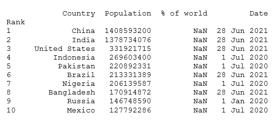
Get the column names of the Table:
print(df2.columns)
Output:Index(['Country', 'Population', '% of world', 'Date','Source(official or UN)'],dtype='object')
Now that we know how to get tables from webpage and convert them into pandas dataframe, it is now time to process the dataframe and get meaningful data.
#Load pandas and matplotlib
import pandas as pd
from matplotlib import pyplot as plt
#URL from where the webpage needs to be scraped
url = ‘https://en.wikipedia.org/wiki/World_population'
#Fetch the tables and convert them into data frames
data_frames = pd.read_html(url)
#Retrieve the table of interest
df2 = data_frames[4]
#Convert the data frame columns of interest into list
countries = list(df2[‘Country’])
population = list(df2[‘Population’])
#Mean Population (in Million) rounded to 2 decimals
print(round(df2[‘Population’].mean()/1000000, 2))
#Median Population (in Million) rounded to 2 decimals
print(round(df2[‘Population’].median()/1000000, 2))
#Filter the data frame columns
df2 = df2[[‘Country’, ‘Population’, ‘Date’]]
#Plot a Horizontal Bar Graph
fig, ax = plt.subplots(figsize = (16, 9))
ax.barh(countries, population)
plt.xlabel(“Population (Billion)”)
plt.ylabel(“Country”)
plt.title(“Top Ten Populous Countries”)
#Show the numeric values along with the bar graph
#Rounding off to 2 decimal places
#Population in Billion
for index, value in enumerate(population):
plt.text(value, index,
str(round((value/1000000000), 2)))
plt.show()
#Convert the table into a CSV
df2.to_csv(“Top_10_Populous_Countries.csv”, index=False)
The Horizontal Bargraph obtained from this table looks as below:

This graph shows the population in terms of absolute number. If we want to plot the same data that shows us the percentage of the population, we can do it using a pie chart as below.
total_population = df2.groupby(“Country”)[“Population”].sum()
total_population.plot.pie(autopct=”%.1f%%”)
plt.show()

Now let’s look at another table Annual Population Growth, which happens to be the 8th Table in the webpage.
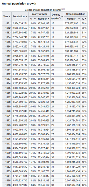
Fetch this table using the following code:
df7 = data_frames[7]
p = df7[[‘Year’, ‘Population’, ‘Yearly growth’]]
Just looking at the table it is not possible to infer any information. It is difficult to understand any kind of pattern in the population rate.
We can get the pairgrid plot to understand the relationship between the Years, Global Population, and Population Growth rates.
To do this, we will have to install seaborn library. Like matplotlib, seaborn is also a visualization library for making various charts in Python. Seaborn helps us in exploratory data analysis. The plotting functions in seaborn operate on pandas dataframes and numpy arrays derived from the datasets. It has the capability to internally perform the necessary mapping and intelligence to produce intuitive and informative charts. Its API are very handy and simple. They lets us focus on what the different elements of your plots mean, rather than on the details of how to draw them. Actually, Seaborn is built on top of matplotlib.
Installing Seaborn
For installing Seaborn, type the following in the command prompt:
pip install seaborn
import seaborn as sns
g = sns.PairGrid(p)
g.map(sns.scatterplot)
plt.show()
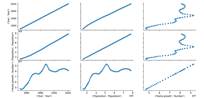
From the plot above, we can make lot of interesting observations.
The Global population always increased but during the years 1950 to 1970 and between the years 1980 to 1990 the rate of population increase peaked. After the year 1990, the global population rate decreased steeply till the year 2000 and then again increased at a slower rate.
Conclusion
We saw how we can scrape data tables from a webpage using pandas. To make sense out of the table we made use of 2 python modules — matplotlib and seaborn. With the help of these modules, we could get various plots from which it was possible to understand the data visually and make few inferences. All this with just few lines of code. Such is the power and simplicity of python. Hope you are feeling little bit more comfortable with pandas, matplotlib and seaborn after reading this article!
